Twisting Wonderland
HOW DID I...
Turn a horizontal UI vertically to experiment and understand user experience then used animation to narrate actions
Case Study
UI/UX DESIGNER
FAVORITE PROJECT
OCT - JAN 2023
.png)
Twisting Wonderland is...
a mobile prototype where I took Disney Japan's Twisted Wonderland and changed its horizontal UI to a vertical UI. I will also improve TW's visual communication and accessibility and include quality-of-life changes that would provide fresh experiences and satisfy player struggles.
ANGLE / VISION
1. Achieve an interactive and fun experience that is more than just tapping buttons
2. Apply visually appealing and communicative design
3. Increase quality-of-life (i.e. shorten user flows)
4. Prototype smooth and complex assets to reflect the final product
5. Explore and experiment with UX/UI design for mobile games
Before & After
The new design clearly differentiates the different content, uses space more wisely, and is more compelling and informative while maintaining the same aesthetic choice.
Initial

.png)
.png)


Revision
.png)
.png)
.png)
%20(1).png)
.png)

.png)
improvements
Fewer options = faster action
Less clustered
Balanced usage of space
Various interactions
Visually appealing
Informational and relevent content
No unnecessary repetition
Balanced usage of space
Visual communication
Interface reflecting the content
Follows aesthetic style
Equally as developer-friendly
Pre-Inspection
Many graphic elements were easily understandable and the layouts were clean. However, there was a noticeable amount of assets, fonts, and visual communication that could be lacking or difficult for user accessibility.


- Essential information such as player name, level, and support character is shown
- Highlight players' favorite card
- Barren/ insufficient content respective to the space used
- Too many "Change" buttons / unnecessary repetition
- Need organized categorization and hierarchy
- Need more visual appeal
- Icons are self-explanatory
- Easy navigation to commonly accessed pages
- Unbalanced usage of space
- Overwhelming content, choices, and assets
- UI not adaptable to device/screen size


- Shows that the player has completed a book
- Unmatched context and design (lacking in visual communication)
- Need more visual cues to differentiate from Twistunes
- Need better hierarchy and organization in fonts and color
- Shows player completion/progress on a twistune album
- Unmatched content and design (lacking in visual communication)
- Not enough visual cues to differentiate from Main Story
- UI not adaptable to device
User Personas
Lesley and Kate are personas that represent the part of the audience that has most traits aligning with the target audience, but do not completely fit the target audience (covering the 13.6% percentiles).


Bartle player taxonomy

User Flow on Decision Making
Although the game already has a flow, it still has very beginner mistakes that show unthoughtfulness to users. I made user flows in FigJam for the Stories, Twistunes, and Lessons which are most commonly visited. These are user flows that focus on the actions and decisions of the users which is much more aligned with my goal of designing a smoother and faster user flow.


Read Main story:
Play twistunes:

Complete lessons:

User Journey
This is a user journey for Leslie the Casual Gamer, the target audience of Twisted Wonderland. For this user journey, I mapped out Leslie's overall experience and included the motivations and frustrations she would encounter from before to after playing.

UX/UI Creative Direction
For Twisted Wonderland's user experience, I want to make the game interface immersive and fun to navigate through. To achieve this, I incorporated the story's first-person point of view into the UI by creating a 3D vision while keeping the original 2D graphics.
References


Foreground, mid-ground, background
%202.png)
%203.png)
Foreground:
- Still / Follows user
- Interactable
- Essentials
Mid-Ground:
- Shift / Controlled by user
- Most interactions
- Content
%204.png)
Background:
- Still or Shift
- No interaction
- Visual que
Aligned
.png)
Aligned:
- First-person movement
- Control of space
Low-Fidelity Wireframes
Home Screens
POP-UPS
HAMBURGER

New profile
More statistics


Quality of life
Bigger for readability
Expanding space
<- SWIPE ->
<- SWIPE ->


Cards

Mirror

Wider graphics
View applied
filters
Twistunes


Record disk UI to match context
<- SWIPE For back
Missions

Shop


Adapting to new UI structure
<- SWIPE ->
Often used
LEssons
Stories
EVENTS
Exams


Drop-down to reduce user flow
<- SWIPE ->
Display information to reduce user flow & quality of life

Book UI to match context


High-Fidelity Wireframes
Lo-Fi
Hi-Fi


%20(2).png)

.png)
Focus:
- Grasping the purpose of each page
- Indication of structure and functionality
- Content ideas
Focus:
- High-quality graphics & reinforcing visual cues
- Clear functionalities and navigations
- Visual representation of the final product
UI Specifics
Sample Components
.png)
Grid measurements


Device size - 817 x 312 (iPhone X/Xs/11/13Mini) (Adaptable UI)
Pixel unit - 5px
THumb Zone

.png)
.png)
.png)
Prototyping Layered Interactions
Animated Drop-Down

interactive card Carousel
Layered interactions between
Foreground, Mid-Ground, and Background
%202.png)
Foreground:
- Acessing information and essential buttons
- Follows the player
- Independent from player
.png)
Mid-Ground:
- Swipe/drag and taps
- Interacting with users
- Depent on player actions
%204.png)
Background:
- Perspective moves within the location
- Dependent on content
- Independent from player
Light User Testing
User testing is one of my favorite stages of UX/UI design. I asked 10 users to perform tasks to show me their struggles and ease in navigation, then asked them for open-ended feedback about the design, navigation, and functions.
Flow task: Navigating through the app to complete all missions (without using "Go").
Smooth Navigation: Twistunes, Alchemy, Exams, Shop - under 5 seconds
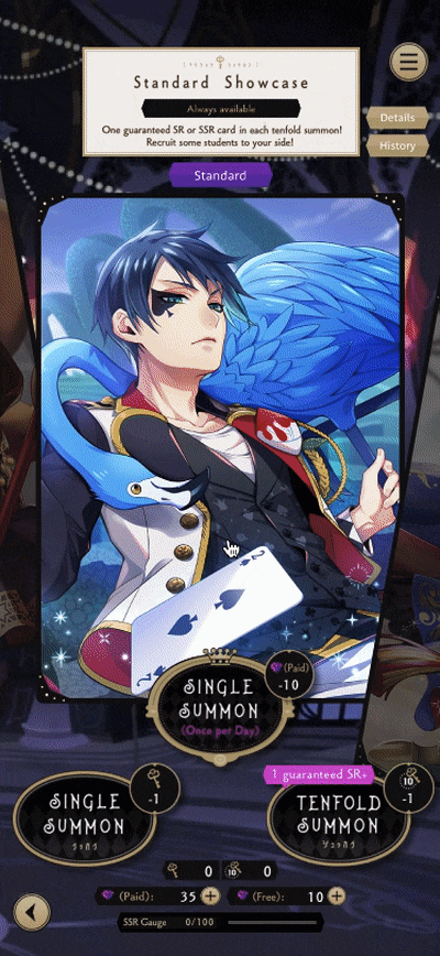
Difficult Navigation: Mirror/Summon, 44% of users struggle - over 7 seconds
Solution: Better UX writing, from "summon" to "use mirror" for clearer indication
Result: 89% of users completed within 5 seconds
.png)

Visual design: What is your most and least favorite screen?
Best Page: Mirror - visually pleasing, good arrangement, high interaction
Profile - statistics
Right of Home Screens - balanced arrangement
Need Improvement: Exams - arrangement
Cards - visibility/size of cards
Solution: Rearranged Exams page and increased card size by 25%
Result: No discomfort from the Exams or Cards page
.png)
Prototype
Final
.png)
User Comprehension: What is this game about?
Common Answers: A summoning (gacha) game to collect characters, leveling characters and skills, rhythm game, world similar to Harry Potter
From user feedback, I also increased font size and adjusted spacing.
The Product
To get a better sense of the functions and interactions, check out the Twisting Wonderland prototype on Figma (Figma works best on laptops and computers).
Credits & Splash


Long Loading

Short Loading

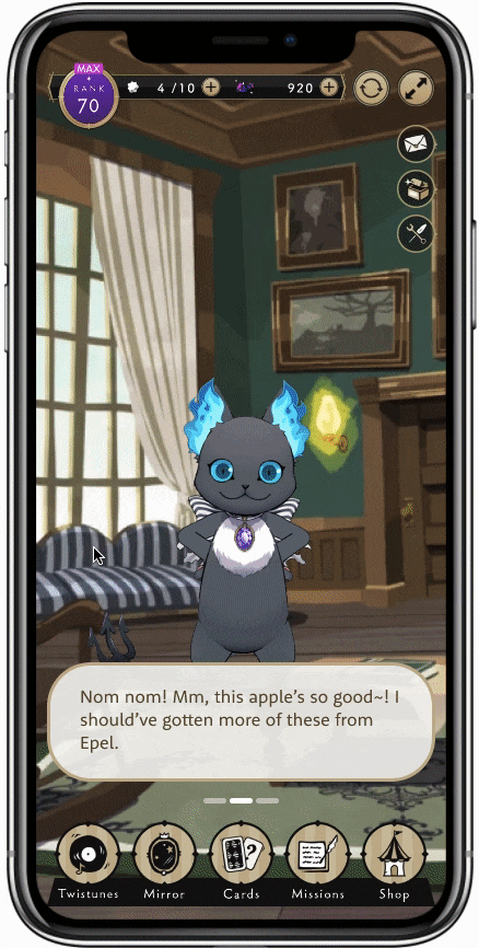
HOME SCREENS
.png)
.png)
.png)
Profile
%20(1).png)
.png)
customize


Menu
.png)
POP-UPS
%20(10).png)

.png)
%20(8).png)
Recharge
%20(7).png)
%20(6).png)
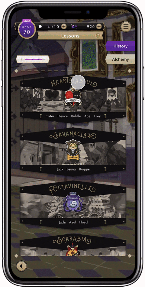
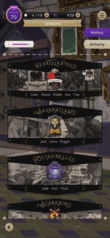
Lessons
.png)


Exams
.png)

Stories


.png)
TWISTUnes
.png)
.png)

Mirror

CArds
.png)
Missions
.png)
.png)
Shop

